The Best Therapist Website design secrets revealed
If you are looking for the best way to design your therapy website, then this is the post for you! I will be revealing to you some of the most effective tips and tricks that I have used in my years as a web designer. These secrets can help grow your practice, attract new clients, and keep them coming back. Your website is an essential part of your business, so don’t miss out on these crucial details!
Therapy websites aren’t about the website — they’re about building a relationship with your potential patients and offering high-value content.
And don’t worry, I’ll show website examples.

Photo by Nubelson Fernandes on Unsplash
Create a visually appealing design that speaks to your target audience.
Your website is more than just a place to send people. It’s a marketing tool that you need to create a visual foundation for your therapy practice. This can be done by using a therapist website template that is sleek and modern-looking. You will want one that matches your branding style to match the overall look and feel of your therapy office. By having a therapist website with a professional design, you will be projecting the image of a therapist who cares about their business and patient experience.
Feature important information prominently.
When first creating a therapist website, it’s easy to get lost in all of the other design choices available to you. However, a few essential pieces need to be included on therapist website templates before anything else. That includes client testimonials, therapist credentials, therapist biography or story, billing details, and contact information. These are the features that people are most likely looking for when they visit your therapist website. Please make sure these are featured front and center so that visitors know precisely what they’re getting right away by choosing your services over another therapist website template option out there!
Use the right colors to make your website pop
Deciding on the best colors to use for a call-to-action can be difficult. When choosing, you must consider the color of your site’s design and what color will complement it. As a general rule of thumb, use colors that are complementary colors to the background. For example, if your site is green, you should go with a red or yellow button that will have high visibility against your green background.
If you want to make it pop, consider using bright colors like reds, greens, and yellows. Similarly, you could also use dark colors in your call-to-action buttons for a different effect.
Use contrasting color schemes in your therapist’s website design.
You can do this by placing black text on top of white backgrounds. This combination makes it easier for the user to read your text and find essential information. White on black can also be a great idea if you want a therapist website design that looks clean and classic.
The color red is associated with action, and we use it on our website to get viewers’ attention when they’ve landed on a page that provides them with information about booking an appointment or highlights information that might be important to them.
The right colors can help you attract clients to your website. These are called “Call-To-Action Colors.” The color orange is a CTA color but is primarily used for action items that are not as urgent as red. Website examples are below.
A hero image boosts your website’s conversion rate and search engine rankings
a Hero image is vital for every website; if you don’t know what a hero image is, a page header that looks like the website’s logo and appears on every page. The purpose of a hero image is to establish your identity as the website owner and to underscore the importance of your site’s content.
The best therapist websites make use of video clips, audio clips, or images that will highlight the therapist’s unique skills. If your therapist’s website is designed well, with pictures of happy individuals enjoying their time with you, it will encourage people to visit your site and feel more connected to you and the experience they might have working together. You will find examples of therapist websites further down in this article.
Include therapist qualifications on your therapist website for reassurance
Your therapist website should feature therapist qualifications prominently so that potential clients are reassured about the therapist they are thinking of working with. Listing your education back to school level makes a potential client question whether you have received the appropriate education needed to provide therapy services. While listing post-graduate accreditations or specializations may help reassure potential clients that you have gone above and beyond what is required to provide therapy services, at the end of the day, potential clients will want to know that you have received proper education and training.
Simplify your therapist website by offering a clear path to conversion.
A mental health website can be overwhelming, which is why it’s important to simplify them before you attract visitors to your site. If you notice that many of your visitors bounce from a website because they believe it doesn’t make sense or leads to conversion, there could be a problem with the site’s content.
Many website visitors are looking for something, and when they don’t find it right away, they leave.
When you make your website easy to navigate by simplifying the process of conversion (e.g., booking an appointment), website visitors will feel like they’re moving in the right direction. If they don’t see themselves converting on your website, the chances are good that they’ll think about visiting another therapist website until they find one that’s easier to use or offers more information or opportunities for them to convert.”
According to Google, website visitors expect fast website load times. When people get impatient with website loading times, they get annoyed and go somewhere else.
Having a website that’s easy to navigate is essential for your website visitors, but it’s even more important for website visitors on mobile devices.
– Make sure that all of the buttons are large enough to click on without accidentally clicking out of the website.- Keep your website text crisp and clean.- Include plenty of white space throughout the website. This will make it easier for website visitors to see what you’ve included (e.g., calls-to-action) and make sense of them.”
Be concise with what you say.
Don’t overwhelm people with too much information at once, but give them enough, so they know who you are and what you do.
The website should be straightforward and easy to navigate.
Make sure the website is straightforward and easy to read, use an appropriate website design for your purpose. Make it simple to find your services and contact information. A good website will also include a blog where you write about what you do and upcoming events. This way, people can learn more about who you are and what you offer and connect with you on social media platforms.
Don’t just say that you’re licensed.
Use language that talks about the benefits of working with your type of therapist over others in the same field. Inclusion of terms like “Board Certified” or “Internationally Certified” makes a significant difference since they are for a licensed professional organization, which is generally more respected in the public eye.
Clearly, State if you Accept insurance or not.
Using terms like “full-time” or “in private practice” show the audience that you do this full time. It also reassures people who may be leery of working with someone not entirely devoted to their work since it means all costs are covered by insurance rather than personally paid for should an emergency arise during treatment.
Give website visitors a quick overview of what you do.
This website provides information on issues such as ADHD, childhood traumas/abuse, and depression to give website readers a general idea of what is offered without having to read through everything. You could use testimonials about how your life has changed since beginning to work with this type of therapist or include your website visitors’ own words about how your services helped them.
The website should provide information on what you specialize in
Give website readers an idea of the types of cases that are most common for therapists like yourself, whether it’s children with ADHD, childhood traumas/abuse, or depression. This website focuses on childhood traumas/abuse and does so by providing statistics on the website as well as their reasons why they focus on this type of therapy.
The website should give visitors a taste of what working with you is like
The website should provide an overview of how readers can expect treatment to feel through the website visitor’s eyes. It should also talk about what therapists like them do in sessions by providing examples of situations that may be present during their therapy, so website visitors know if it would be a good fit for them or not.
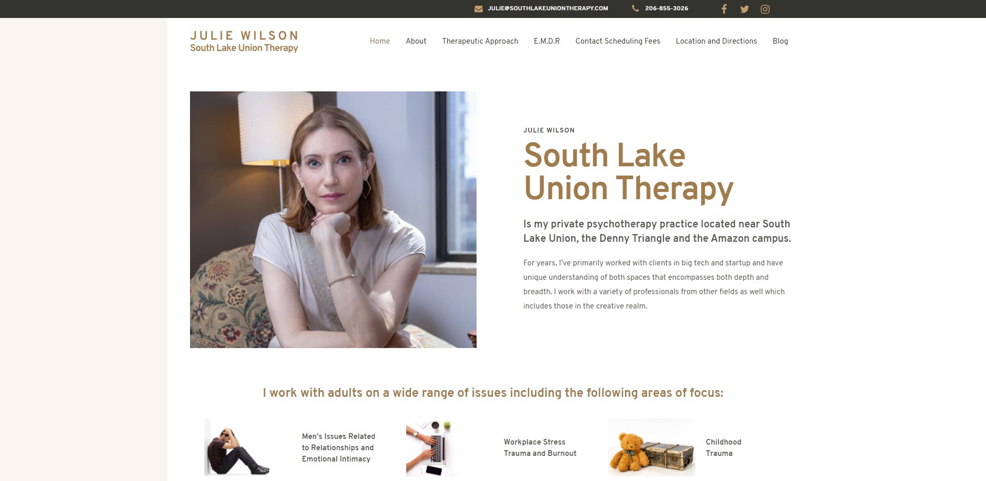
SouthlakeUnionTherapy.com

The first page we are looking at is a private practice psychotherapy therapist website, Julie Wilson. This is a very straightforward website design. The first thing you see on the home page is a picture of Julie. Right away, you are able to connect with her, see she is a human being just like you.
Things this website gets right:
- Design & Flow. This website features a blog with relevant information about her therapy practice. By including a blog and updating it with pertinent information increased the website’s SEO. It also lets visitors know you’re still active.
- Look & Feel. All of the pictures are from inside of the therapy office or the area surrounding it. This helps potential clients become familiar with where they will have their sessions. So they feel more at ease when coming to your practice for the first time and subsequently.
How this website could be improved:
- A Lead Magnet. southlakeuniontherapy has prominent contact information but not a call to action or lead magnet. A lead magnet is a thing you give someone in order to entice them to complete an action, such as filling out a contact form. It can be anything from an ebook to a free consultation or some other relevant incentive. This can be used to keep potential patients updated to date with your practice developments and improvements.
- Client-Centered Design. Much of the text on the website is not written from the point of view of the potential patient. While you can understand the therapist is well qualified, there is no examples or explanation of how I will be helped or what to expect.
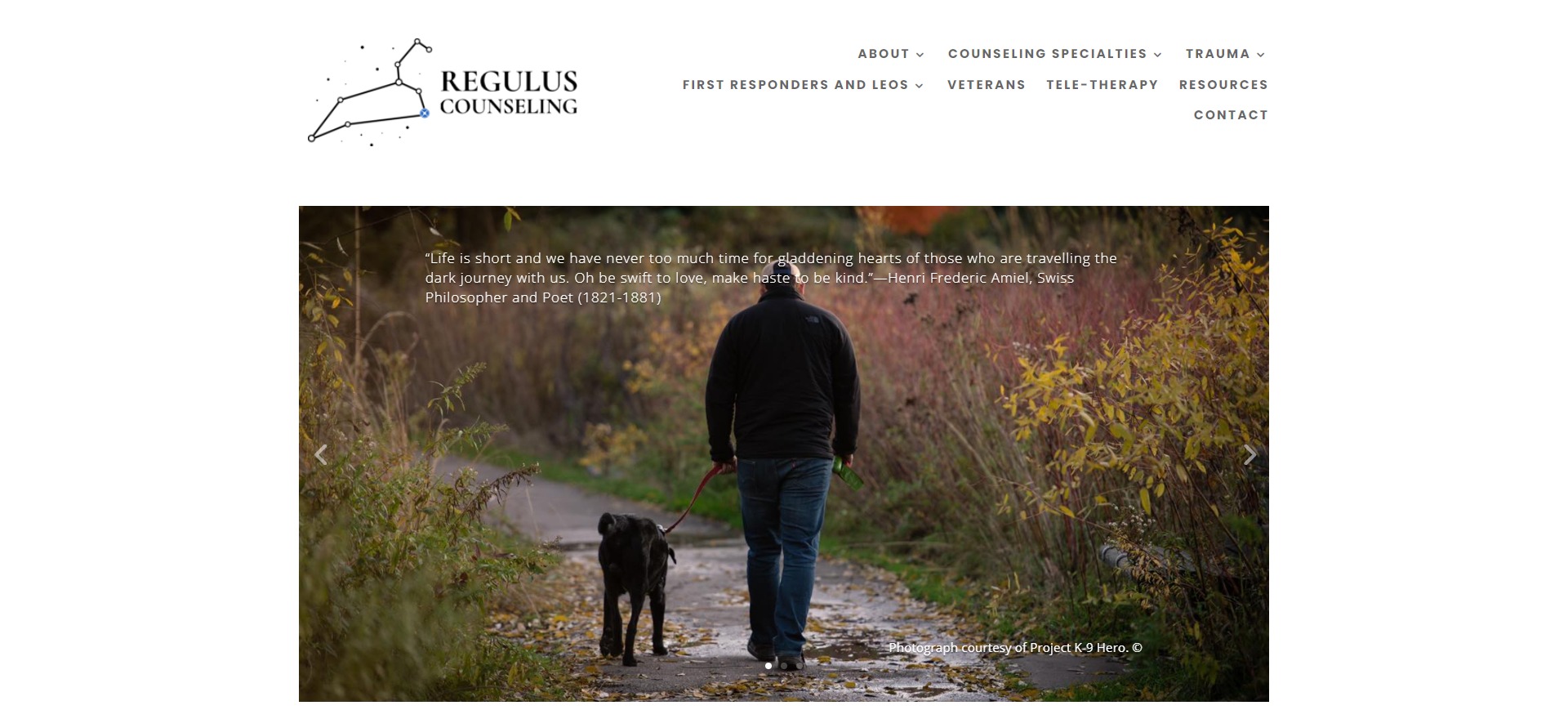
RegulusCounseling.com

I have to admit I have a sweet spot for RegulusCounseling, and They are one of my clients. RegulusCounseling is a trauma counseling practice that has a particular audience, First responders, Law enforcement, Military, and veterans’ otherwise known referred to as “LEO’s.”
Helping those who help.
When designing their website site, they wanted a logo that resonated with their audience, The regulus Star or the Lion Star. When you enter the home page, you can quickly understand they are here to help. The hero image, with a firm handshake and a kind look in the eye, is something we don’t see nearly often enough in web design.
This client chose to integrate their logo and mission statement into several points on the website, and While this choice may not work for every brand, it does send a clear message that their web presence is one of their core values. You can see their reference’s mission throughout their website.
Things this therapist website gets right:
Appearance & Feel. RegulusCounseling has a very good look, grey hues, and a clean layout. One thing I really appreciate is the therapist bio section, therapist offices are generally not very exciting places to be, but they manage to make these offices feel inviting. This site is easy enough for anyone to cruise through, while it has enough therapist-specific content for their clients to know this is the place they want to be.
A solid call to action. – They made good use of CTA colors, drawing the attention of the viewer to the “schedule buttons”, This also lets clients schedule a meeting right away by using online scheduling software. By reducing the steps to a conversation, it can remove obstacles to getting help.
How this website could be improved:
Email or newsletter sign up. – Many visitors will visit a mental health website many times before feeling comfortable enough to call. Having a newsletter lets visitors understand you more through articles and keeps them updated on developments in your practice.
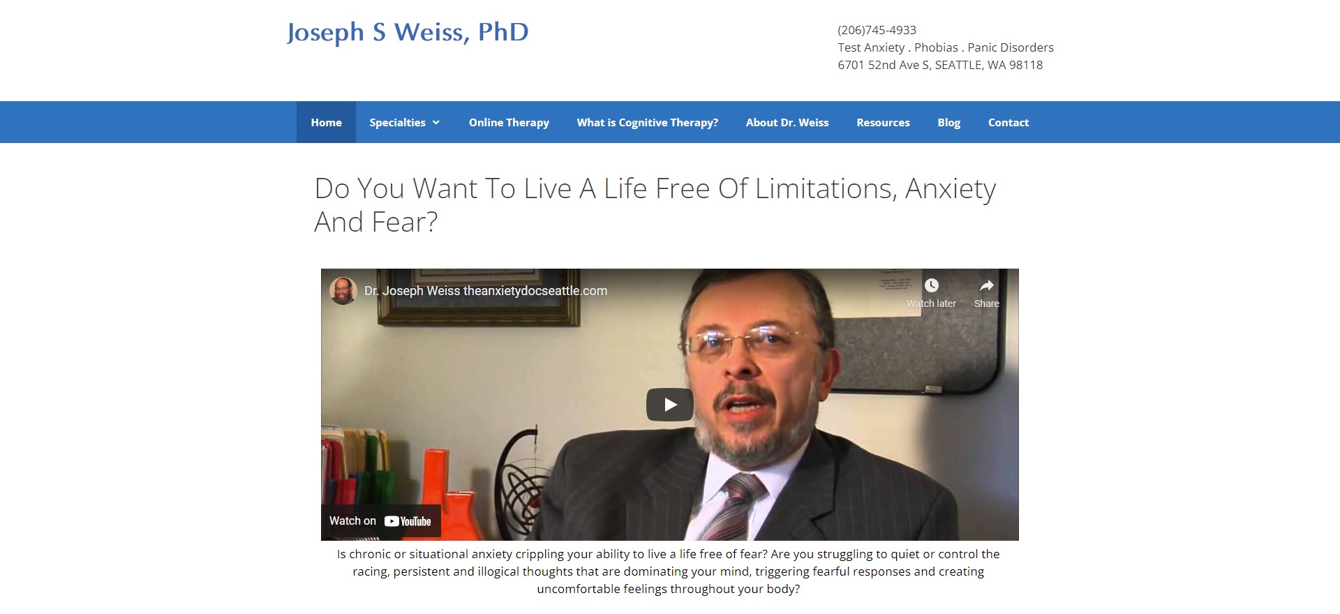
theanxietydocseattle.com

Things this therapist website gets right:
Video. They offer a video on the home page that introduces their service. This is an excellent feature to have, and I urge other psychologists to consider it. A video on your website is a fantastic way to increase interaction. People are often eager to click play; they just want to see what happens, and videos engage in a way that plain text alone cannot.
Trust and Authority. Starting with the Domain “The Anxiety Doc Seattle” clearly displays his specialty. Throughout the website, information about the clinician’s credentials is prominent then. In addition to that, the website includes many blogs and introduction videos.
How this website could be improved:
Better use of color. This website is laid out well and has a clear message, but the color selection is bland. The call to action buttons uses blue instead of red or orange. Blue is a calming color and would be less likely to lead people to choose the therapist
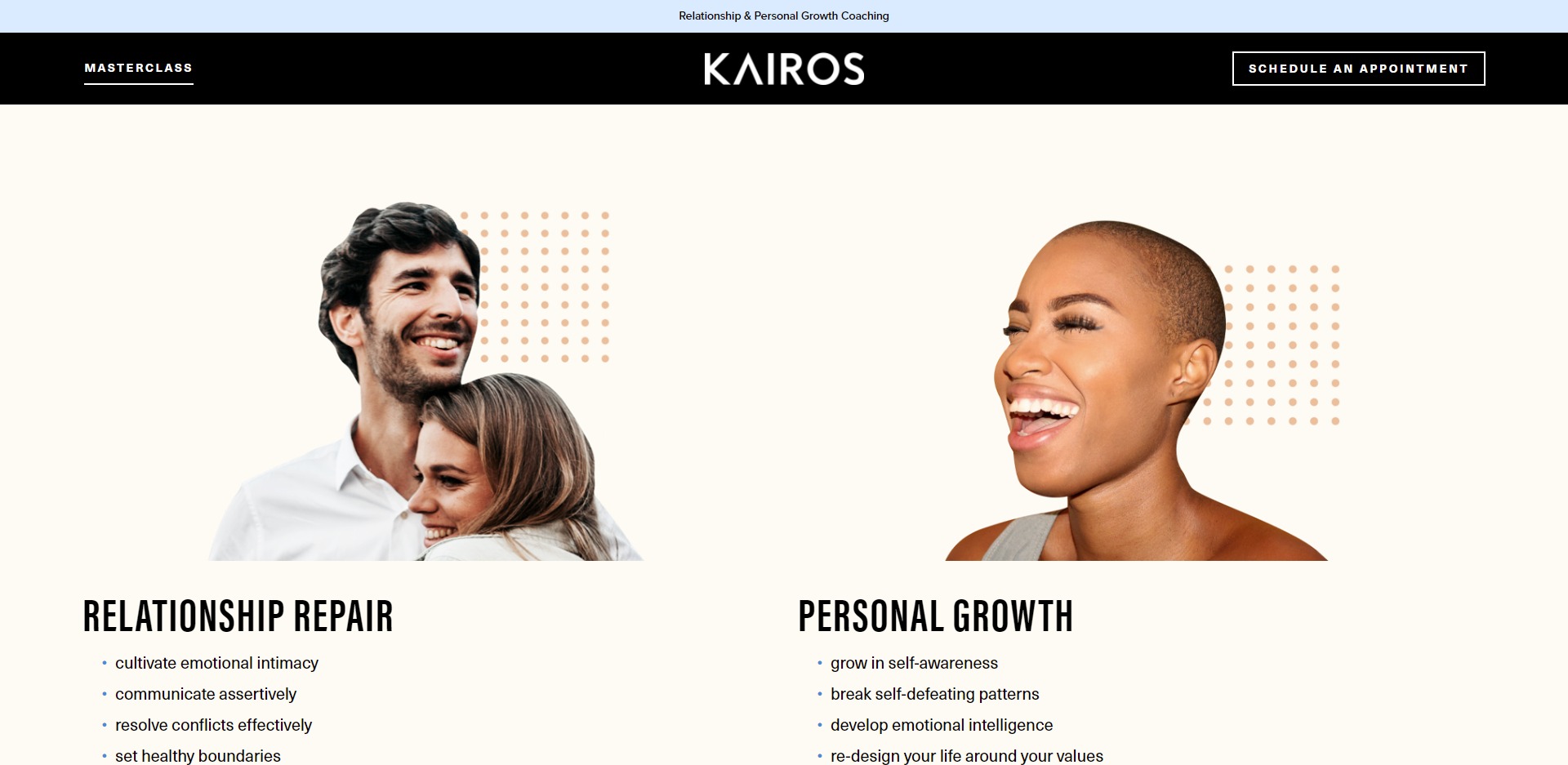
mykairos.life

Couples counseling and relationship repair.
Things this website gets right:
Hero Image. The first image and message you see is of a happy couple and a prominent statement about personal and relationship growth. The therapist offers a free 20 minute consult with all new clients to discuss therapy goals and ensure compatibility. This is an excellent way for therapists to get a sense of what the client wants from therapy and how they might be able to help them.
Lead Magnet. – Kairos is offering a master class and waitlist for clients who want to learn more about his classes. They offer an easy schedule button that allows you to see Kairos’ schedule and set it up right away. They do an outstanding job of communicating directly to the potential patient focusing on their needs and the process of counseling.
Client Stories. – By including client stories and testimonials, potential patients can hear real people talk about their experience with the therapist. This provides a great insight into the therapist’s ability to communicate and connect with others, as well as how they may be able to help them.
How this website could be improved:
Improve their lead magnet. It’s a great thing to be able to join a waitlist, but there is no other offer than to wait, or if there is more included, it’s not clear. It’s best to be clear about what you are offering in exchange for your client’s email and to offer a simple downloadable related to the offer. A therapist website does not have to be highly complicated. It just has to be relevant and communicate what you need to say with clarity.
To Focused. It’s pretty obvious the only path is to sign up for the master class or email because of this, and there is no navigation at the top of the page. A user must complete the entire page before finding the “about” section. This restricts the therapist from being able to capture new clients who want some general information about therapy before making a commitment.
Your website is your digital door to the world. It’s where potential customers will first come into contact with you and form an opinion of who you are, what you do, and how they can become a customer. All it takes for this process to go smoothly is some basic web design know-how that we hope these tips and website examples have helped give you. Now all that’s left to do is get started on designing your new therapist website! Reach out if you need help with any part of the process or want more information about any of our services.
What do I offer?
- To assist you in discovering your unique voice (You want your website to be a representation of you)
- Identify your audience (Knowing your target audience will help you figure out how to reach them.) and target keywords to use on your site.
- A beautiful design ( photos and graphics to help your content stand out.)
- Do all the technical lifting if needed (Registering your domain, Implementing SEO strategies, and Building your website)
How does it work?
I have four web design packages based on how involved in the process you want to be. I have it broken down into 3 overarching steps:
Discovery: The first stage in developing your therapy website is to discuss your practice and who you want it to appeal to. I’d like you to complete my website planning checklist so that I can understand your approach and design preferences. The more I can understand about your unique practice, the more I am able to personalize your site, so it is an accurate reflection of your practice
Refine & Prototype- after discussing your practice and design preferences, I will create a wireframe draft or graphic concepts for you to review online. This will either be a direct link or a graphic file that will be emailed to you to review. After I receive your feedback, what you like, don’t like, and other changes you would like. It might take up to three iterations of revisions to shape your website to reflect your own distinct style and attract the ideal clients
Live Launch- Now that we have refined your website using your feedback, I will show you the basics of managing and performing essential updates to your website. You’ll receive 30 days of maintenance support. I offer additional maintenance services; contact me for more information
